
Where every number comes from, and how to set your targets
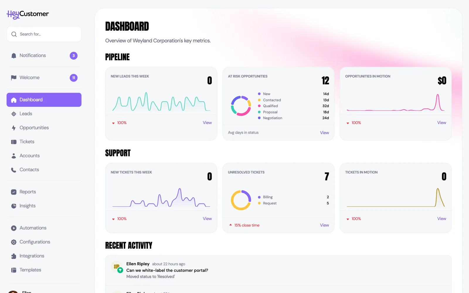
Dashboard and Insights are the two places Hey Customer does the math for you. Dashboard answers "what needs me today?" Insights answers "how healthy is my pipeline, and am I on track?" This article walks through every tile on both pages and explains exactly how each number is worked out.
Neither page has settings to configure or reports to build. You open them and the numbers are already there, calculated fresh from your live records every time the page loads. There is nothing to refresh, schedule, or wait for.
The two pages answer different questions. Dashboard is short-range and operational — what you owe someone today, what nobody has picked up, what is going stale, and what your team touched. Insights is about the pipeline as a whole — what it is worth, how fast it moves, how often you win, and how you are tracking against your goals.
What you see depends partly on your permissions. On Insights, every lead and opportunity in the organization is counted if your group has permission to view all pipeline records, and only the records assigned to you if it does not. The Dashboard's Pipeline tiles don't use that setting: Follow-ups and Going cold are always your own work, and Unclaimed leads is always the whole organization.
The Dashboard is split into Pipeline, Support, and Recent activity. The Pipeline tiles are a short to-do list: what you owe someone today, what nobody has picked up yet, and what is going quiet. The Support tiles each show a headline number, a small chart, and a percentage change along the bottom. Every tile has a View or View all link that opens the matching list, already filtered.
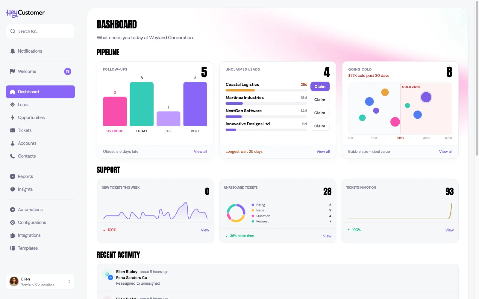
Follow-ups is your own work, whatever your permissions. It charts the open opportunities assigned to you by when their next step is due: a hot-pink bar for overdue, a teal bar for due today, then the next weekday in lilac and the rest of the calendar in violet. The headline number is overdue plus due today — the work in front of you, not everything you have booked. The footer notes how late the oldest one is, and View all opens the opportunity list filtered to the same set. When you are caught up the tile says so, and if you don't own any open opportunities it tells you that instead and links to the full pipeline.
Unclaimed leads is the one tile that always covers the whole organization. It counts the open leads nobody owns yet and lists the five that have been waiting longest, each with a bar showing its wait on a shared scale — the longer the bar, the longer the wait, turning amber after three weeks and red after six and a half. Claim beside a lead assigns it to you on the spot, without leaving the Dashboard; the oldest lead's button is highlighted, since it needs a decision first. Claim appears only if your group can be assigned pipeline records — everyone else still sees the queue. If two people claim the same lead at the same moment, the first one gets it and the other is told who it went to.
Going cold shows your own open deals that are losing momentum. A deal appears once it has gone without contact for longer than your Green threshold, and counts as cold once it passes the Red threshold — both set in your Momentum thresholds, under Configurations, then Opportunities, then Momentum (Red is 30 days unless you have changed it). The same Red rule turns a deal's dot red on the pipeline board, so the board and the Dashboard always agree. Logging a call or a meeting, sending an email from Hey Customer, or a reply landing from a contact all count as contact; editing or reassigning the record does not. Each deal is a bubble: the further right, the longer since contact; the bigger the bubble, the more the deal is worth (its one-time and recurring values added together, not weighted by probability); the colour is its status. The shaded cold zone starts at the Red threshold — deals to its left are losing momentum, deals inside it have lost it. The worst deal gets a halo, the amount above the tile's number is the total value sitting past the Red threshold, and selecting a bubble opens the deal.
New tickets this week works exactly like new leads: tickets created since Monday, a 30-day daily chart, and a comparison against all of last week.
Unresolved tickets counts every ticket sitting in a status that counts as open, broken down by ticket type in the donut. The percentage along the bottom is the interesting part: it compares how old your open tickets are on average against how long it actually took to close the tickets you closed in the last 30 days. Green means your open tickets are younger than your typical close time, so you are keeping up. Red means they have already been open longer than a ticket normally takes you to finish. If you have not closed anything in the last 30 days there is nothing to compare with, and the tile reads "On track".
Tickets in motion counts how many separate tickets your team touched since Monday — a ticket worked on five times still counts once.
Below the tiles is a running feed of what has happened across the organization: records created, statuses changed, deals won and lost, notes added, and reassignments. It loads ten entries at a time, and Load more pulls in the next ten.
Insights is one page about your pipeline. It always shows the current calendar month — there is no date range to pick.
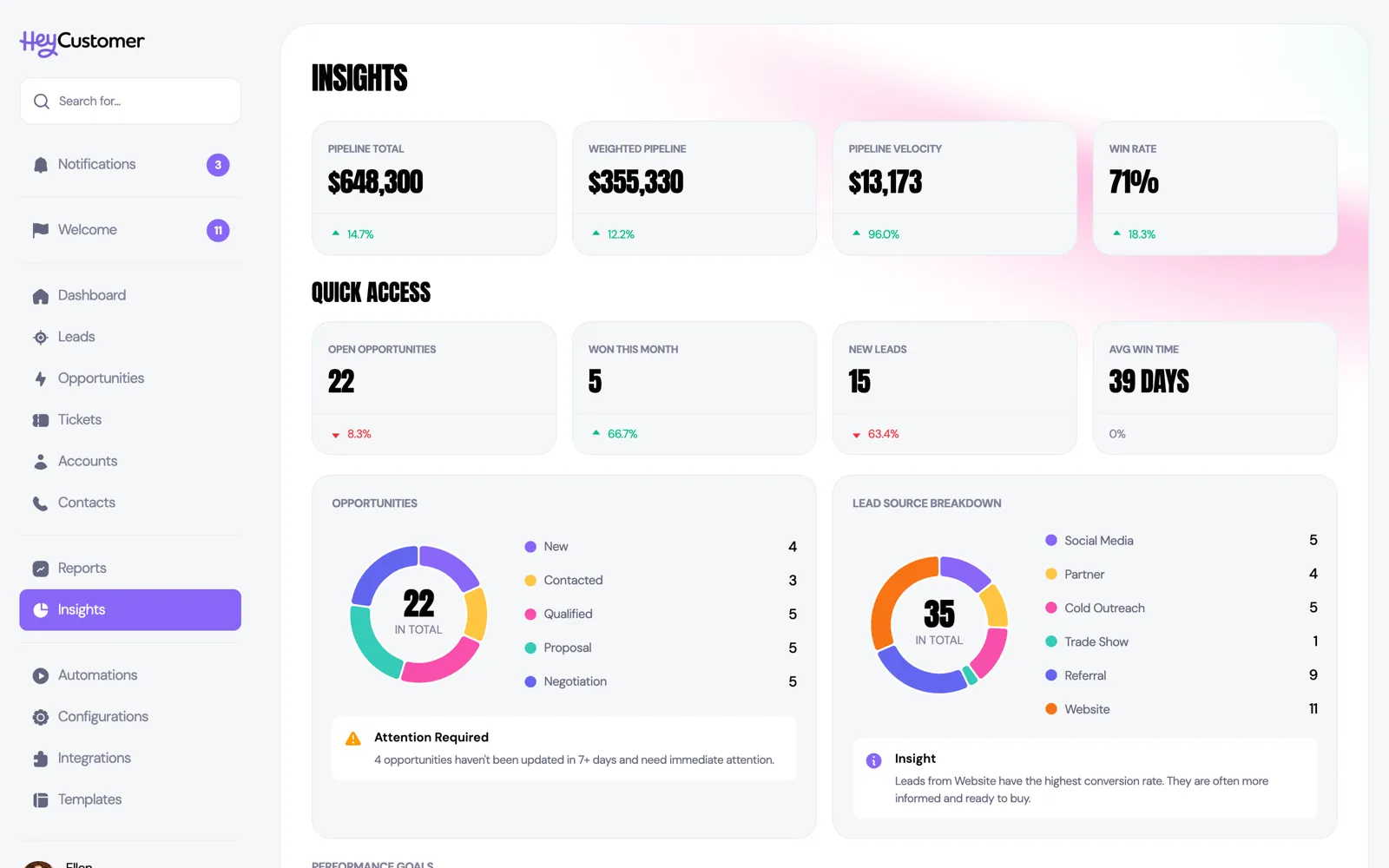
Pipeline total is the raw size of your open pipeline: the one-time value plus the recurring value of every opportunity that is neither won nor lost.
Weighted pipeline is the same pipeline discounted by how likely each deal is to close. Every status carries a probability percentage, which you set yourself under Configurations. A $50,000 deal in a status set to 40% contributes $20,000. Add those up across every open deal and you have your weighted pipeline. It is normally the more realistic forecast of the two, and it moves whenever a deal changes status — not only when its value changes.
Pipeline velocity estimates how much value your pipeline produces per day. It multiplies the number of open opportunities by the average value of the deals you won this month, multiplies that by your win rate, then divides by the average number of days it took to win those deals. Because it depends on deals you have actually closed this month, it shows $0 in a month where nothing has been won yet.
Win rate is the share of decided deals that went your way this month: deals won divided by deals won plus deals lost, as a percentage. Deals still open are not counted either way, so a slow month with few closures can swing this number a long way.
The four Quick Access cards are simpler counts. Open opportunities is how many deals are neither won nor lost. Won this month counts deals marked won since the first of the month. New leads counts leads created since the first of the month.
Avg win time is the average number of days between creating an opportunity and winning it, measured across the last twelve months rather than this month alone. That longer window keeps the number steady, and stops it emptying out in a month with no wins. It is compared against the twelve months before that. Getting faster is good, so this card turns green when the number goes down.
The Opportunities donut breaks your open deals down by status, with the total in the middle. Beneath it, an Attention required note appears whenever open opportunities have gone seven days or more without contact, and tells you how many.
The Lead source breakdown donut counts your leads by where they came from. This one has no date limit — it is every lead you have, not just this month's. The Insight note underneath names the source that has brought you the most leads.
Four progress rings show how you are tracking against targets you set yourself. Above them, a line tells you how many of the four you have met.
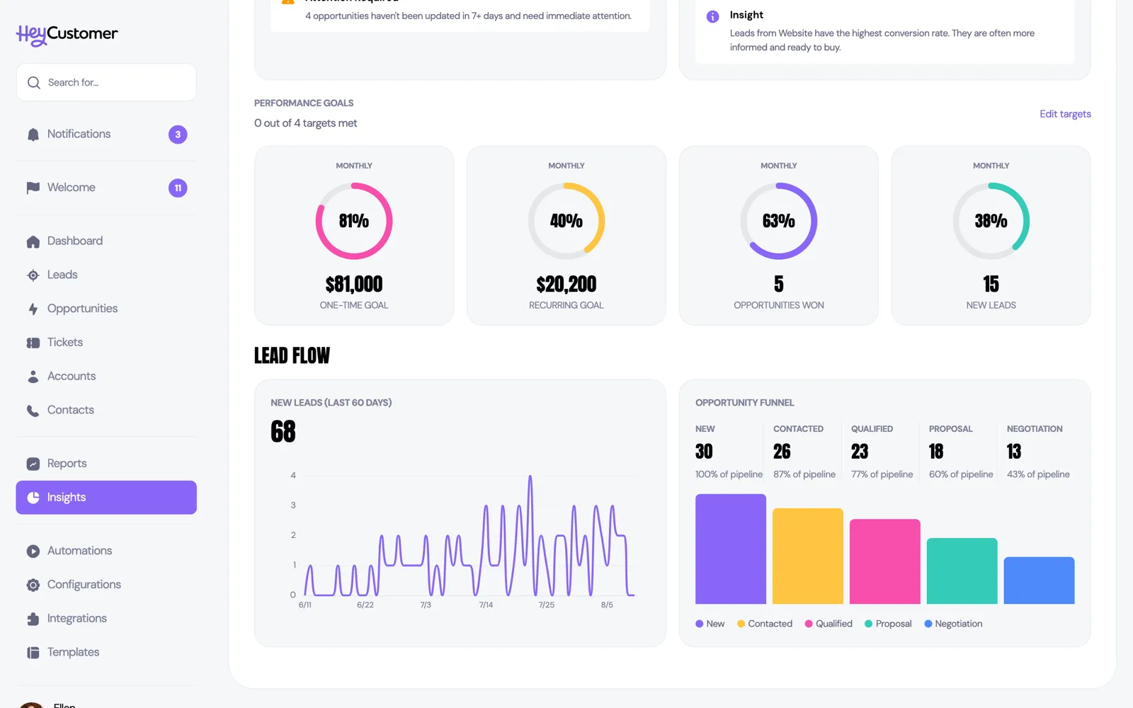
Each ring measures a different thing. One-time goal adds up the one-time value of the deals you won in the period. Recurring goal does the same for recurring value. Opportunities won counts deals won. New leads counts leads created. The percentage in the middle is simply what you have achieved divided by what you aimed for, and it stops at 100% however far past the target you go.
Each goal is set to either Monthly or Annually, shown on the badge at the top of the card. Monthly measures the current calendar month; annually measures the current calendar year. You can mix them — an annual revenue goal alongside a monthly lead goal is perfectly normal.
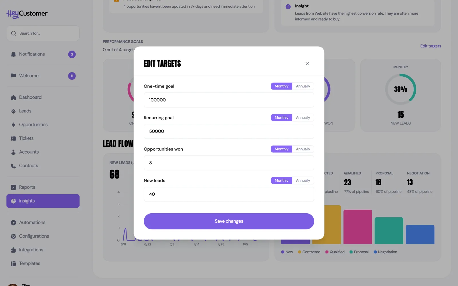
Targets belong to the organization, not to you. Everyone who can see Insights sees the same goals, and a change you save applies for the whole team.
New leads (last 60 days) plots how many leads arrived each day for the last 60 days, with the total for the whole period as the headline figure. Days with no leads are drawn as zero rather than skipped, so the shape of the line reflects real gaps.
The Opportunity funnel shows how far deals get. For each status it counts the deals that have reached that point: every open deal currently sitting at that status or a later one, plus every deal you have ever won, since a won deal passed through all of them. The percentage under each status is that count measured against the first status, so it always starts at 100% and falls away as deals drop out. A status where the number drops sharply is where deals are getting stuck.
The Support tiles and most Insights cards carry a percentage with a colored arrow. It is always the same calculation: the difference between now and the comparison period, divided by the comparison period.
Two things are worth knowing about it. When there is nothing to compare against — no leads last week, no deals closed last year — the tile shows 0% rather than an invented number. And for the tiles where a smaller number is better, like average win time and unresolved ticket age, the color is flipped: falling is green, rising is red.
Still need help? Email us at support@heycustomer.com