
Help Center
 ›
Create a report

Create a report

Build exactly the view you need, in four steps
Create a report

A report answers a question about your data — which opportunities close this quarter, which tickets are still open, which accounts you haven't spoken to. You build one by picking what to report on, choosing the columns you care about, narrowing the rows with filters, and setting the order. Nothing is fixed: every choice can be changed later, and you see your real data update as you go.

How it works

Reports are built in four steps — Columns, Filters, Sorting and Preview — after you choose a starting point. A progress bar across the top shows where you are, and you can go back to any earlier step without losing your work.

Underneath every step is a live preview of your actual records. Add a column and it appears; add a filter and the rows narrow immediately. You're never guessing what the finished report will look like.

Nothing is saved until you choose to save it, so you can explore freely. Once saved, a report can be run again any time, exported, edited, and shared with the people who need it.
Choose what to report on

  1. Select Reports in the left sidebar, then Create a new report.
  2. Pick the kind of record your report is about: Accounts, Contacts, Tickets, Leads, Opportunities or Documents.
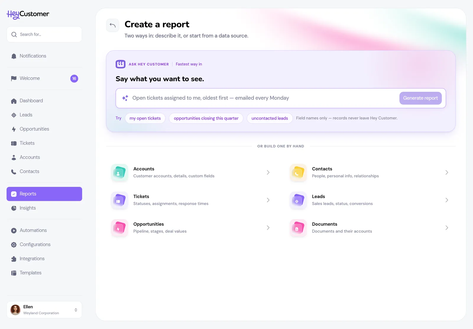
The Create a report screen in Hey Customer. At the top is a lilac Ask Hey Customer box reading Say what you want to see, with a prompt box, a Generate report button and three Try suggestions. Below a divider reading Or build one by hand, six data sources — Accounts, Contacts, Tickets, Leads, Opportunities and Documents — are listed in two columns, each with an icon and a short description.

This choice sets what each row of the report represents. A report started from Opportunities gives you one row per opportunity; one started from Tickets gives you one row per ticket.

Or describe it in plain English

The box at the top of the Create a Report page — and at the top of the Reports page itself — is a shortcut through the next three steps. Type what you want to see — "open tickets assigned to me, oldest first", or "accounts created in the last 30 days, sorted by name" — and select Generate report. Not sure what to ask? Select one of the Try ideas under the box, or More ideas for another set. Hey Customer works out which kind of record you mean, picks the columns, sets the filters and sorting, names the report, and takes you straight to Preview with your data showing.

A note at the top of the preview shows the request the report was built from. If something you asked for couldn't be matched to a field or a value in your data, the note says what was left out, and you can step back to add it by hand. Select Edit request to go back to the box and try different wording. If a request is too vague to build from, you're asked a short question instead.

Mention a cadence — "email it to me every Monday morning" — and after you save, the schedule page opens already filled in. See Schedule a report.

Choose your columns

Columns are what you see across the report. Pick as many or as few as you like.
  1. Type a name for your report over the placeholder at the top of the page. You can change it later.
  2. Select the plus button beside any column in Columns to choose from to add it.
  3. Drag the handle beside a selected column to change the order columns appear in.
  4. Select the minus button to take a column back out.
  5. Select Next step when you're happy with the shape of it.
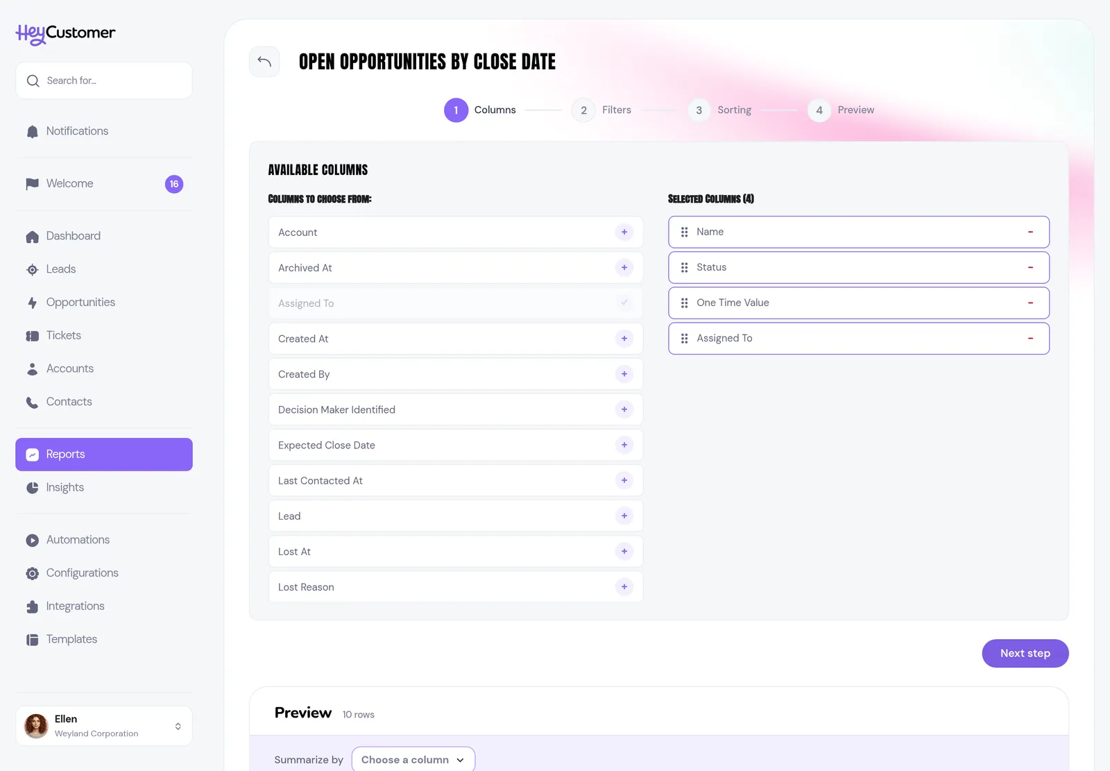
Step 1 of the report builder in Hey Customer, Columns. The left panel lists available columns each with a plus button; the right panel shows four selected columns — Name, Status, One Time Value and Assigned To — each with a drag handle. A live preview appears below with a Summarize by strip above the rows.

The list of available columns is wider than it first looks. Alongside the standard details, it includes any custom fields your organization has added for that record type — so anything you've chosen to track shows up here automatically. It also includes details pulled from related records, such as the account an opportunity belongs to or the person it's assigned to. Columns that come from a related record are labeled with where they come from.

Narrow it down with filters

Filters decide which rows make it into the report. Without any, you get everything.
  1. Select Add a filter.
  2. Choose the field to filter on.
  3. Choose how to compare it — the options change to suit the field.
  4. Enter or pick the value. For fields with a fixed set of choices, start typing and select as many values as you want; each becomes a removable chip.
  5. Select + Add another filter to keep narrowing. Filters stack, so a row has to satisfy all of them.
  6. Select Continue, or Skip if you don't need any filters.
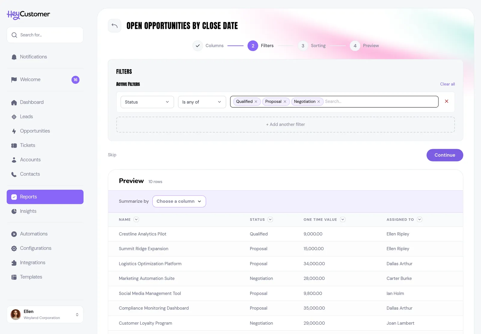
Step 2 of the report builder in Hey Customer, Filters. A single filter row reads Status, Is any of, with three chips for Qualified, Proposal and Negotiation. The preview below has narrowed to only opportunities in those three statuses.

What you can compare depends on the kind of field:

  • Fields with set choices, such as a status or an assigned teammate: Is any of, Is none of, Is empty, Is not empty.
  • Text: Equals, Not equals, Contains, Does not contain.
  • Numbers and amounts: Equals, Not equals, Greater than or equal, Less than or equal.
  • Dates: Equals, On or after, On or before, Between, or Relative — a moving window such as Today, Last 7 days, Last 30 days, This month, Last month, This quarter or This year.
  • Checkboxes: Equals, Not equals, Is empty, Is not empty.

A relative date filter is worth knowing about: a report filtered to "Last 30 days" always covers the 30 days up to whenever you run it, so it stays current without you editing it.
Set the order

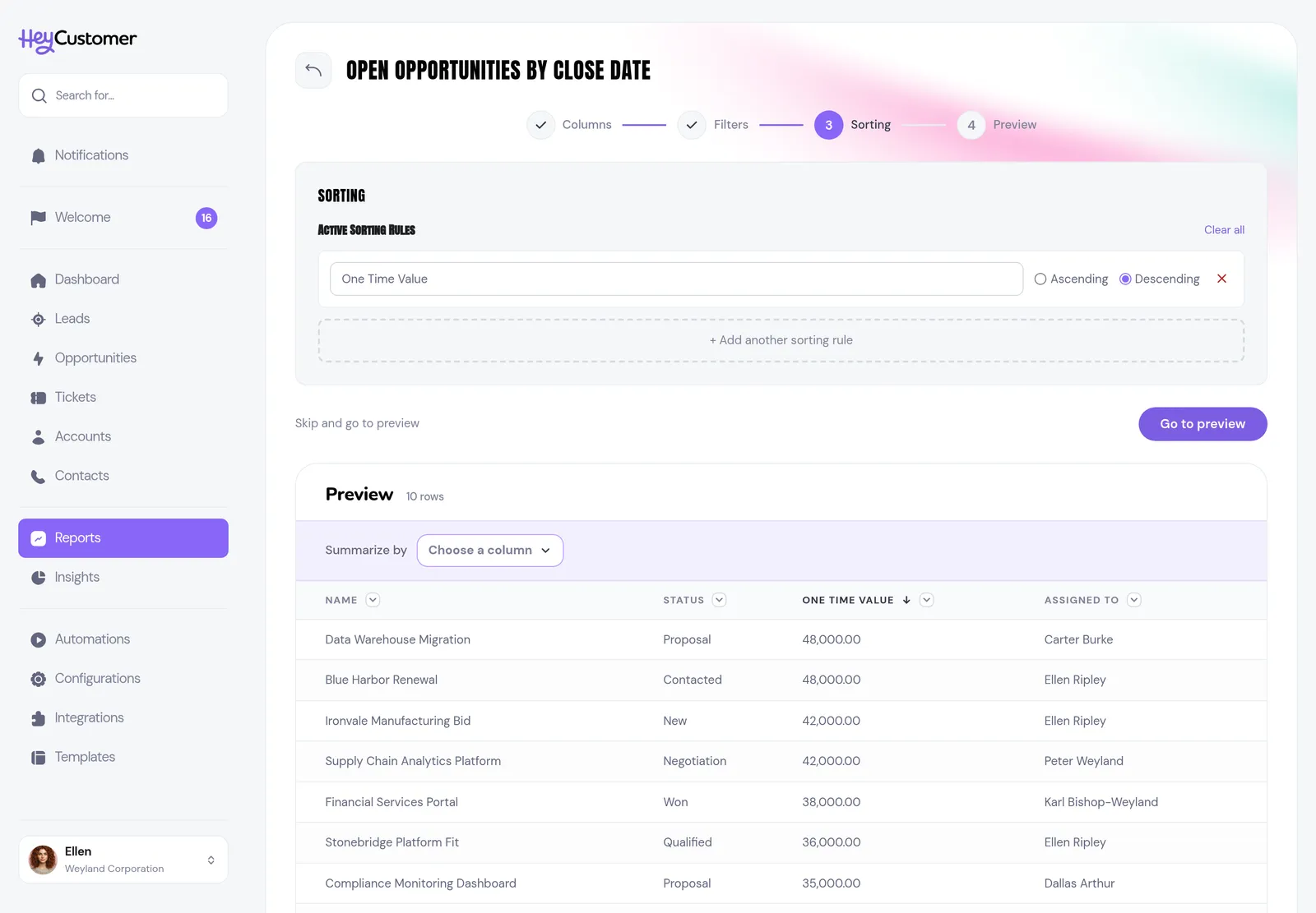
  1. Select Add a sorting rule.
  2. Choose a column and pick Ascending or Descending.
  3. Select + Add another sorting rule to sort within the sort. Rules apply top to bottom: the second rule only breaks ties in the first.
  4. Select Go to preview, or Skip and go to preview.
Step 3 of the report builder in Hey Customer, Sorting. One rule is set: One Time Value, Descending. The preview below is ordered by value, highest first.

You can only sort by columns you've already selected, so if a column you want to order by is missing, step back to Columns and add it.

Group and chart your results

A report doesn't have to be a list of rows. The strip above the results turns it into one row per group — per status, per owner, per month — and works out the numbers for you. It reads as a sentence: Summarize by a column, showing a measure, sorted the way you want. It's there on the preview under every step, on the Preview step, and on a saved report.
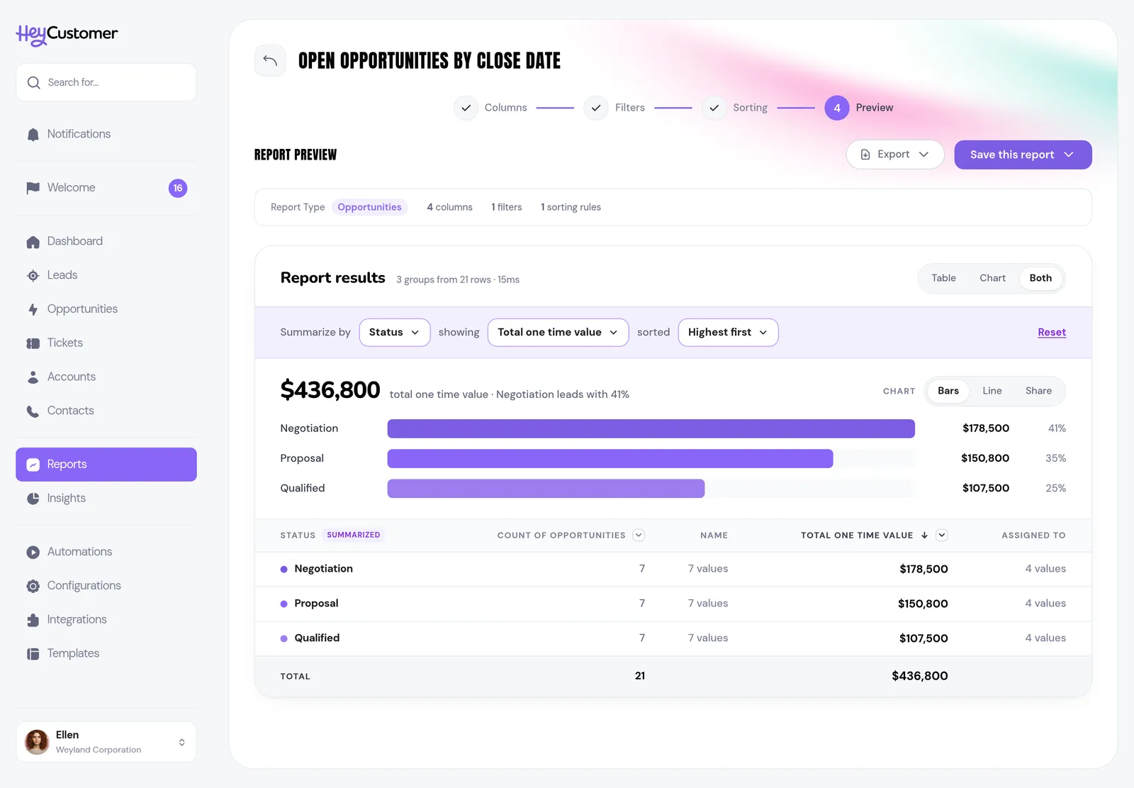
  1. Select the column beside Summarize by. Statuses, sources, people, yes or no fields and dates can all be grouped on; a date also asks whether to group by Day, Week, Month, Qtr or Year.
  2. Select the measure beside showing: the count of records, or the total or average of any number column.
  3. Select the order beside sorted — highest or lowest first, or A to Z (oldest or newest first for dates).
  4. Switch between Table, Chart and Both, then pick the chart: Bars, Line or Share.
  5. Select Reset to go back to the plain list of rows.
A report in Hey Customer summarized by status. The strip reads Summarize by Status, showing Total one time value, sorted Highest first. Below it the grand total is followed by ranked bars for Negotiation, Proposal and Qualified with their values and shares, and a table of the same groups with a SUMMARIZED badge on the Status column.

The total for the whole report sits above the chart, with a line telling you which group leads and by how much. Select any group — the row, its bar, its point, or its slice — to open the records behind it.

Bars ranks the groups largest first, so the order is the point. Line gives you a point per group, which suits months and weeks. Share is a donut with the total in the middle, for when you want the split rather than the ranking.

Preview and save

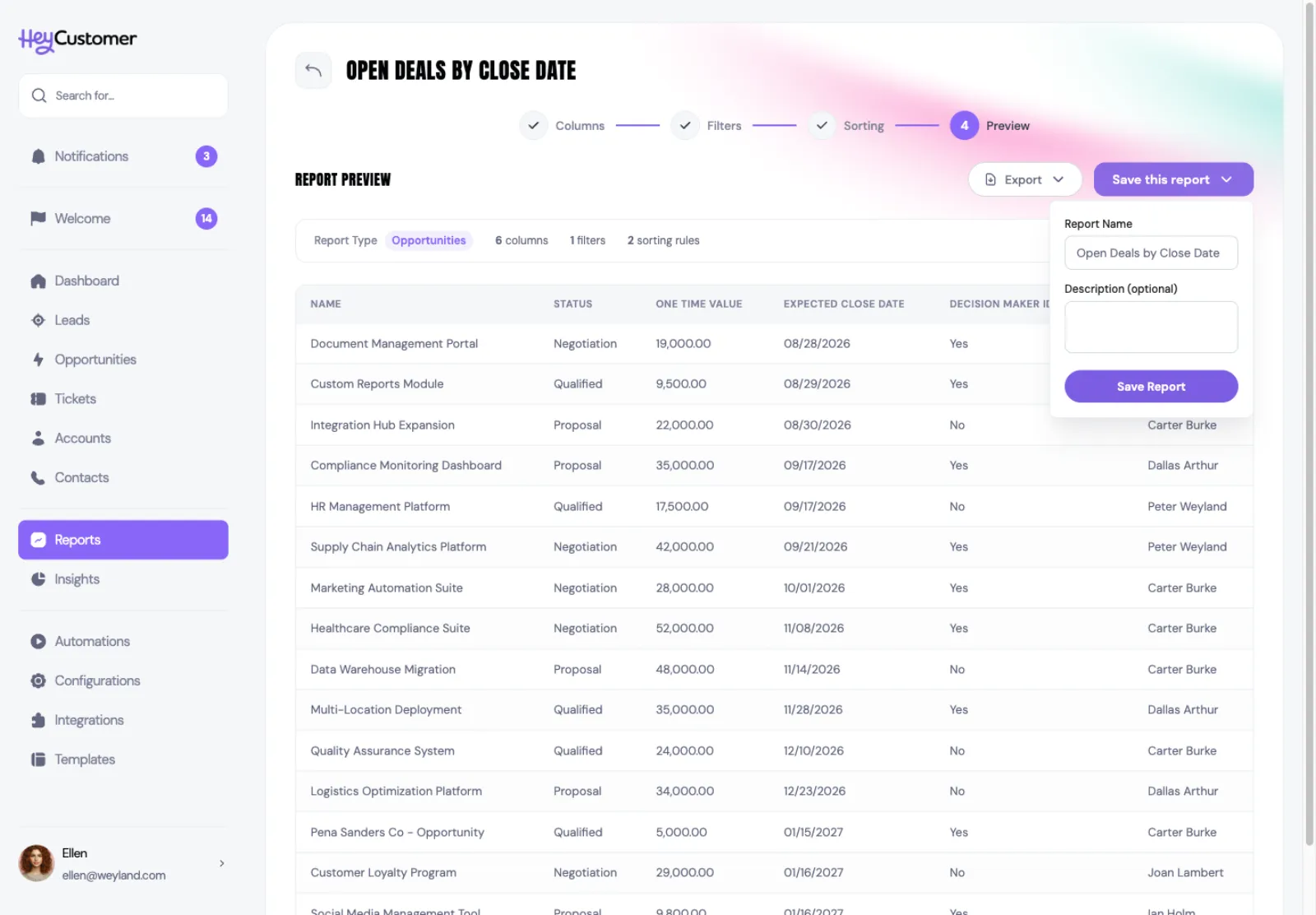
The last step shows the finished report with a summary of what you built — the record type, and how many columns, filters and sorting rules it uses.
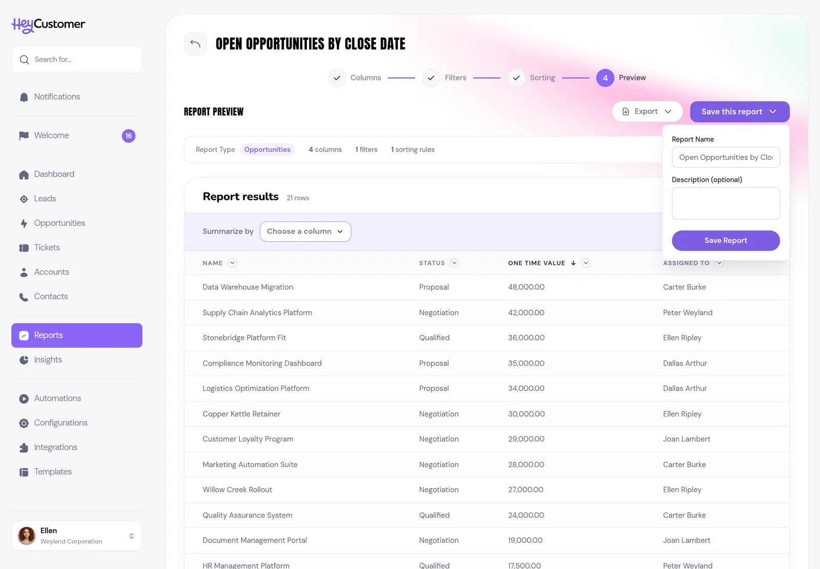
  1. Check the results. If something looks wrong, step back and adjust; your work is kept.
  2. Select Save this report.
  3. Confirm the name and add a description if it helps others understand what the report is for.
  4. Select Save Report.
Step 4 of the report builder in Hey Customer, Preview. A summary bar reads Opportunities, 4 columns, 1 filters, 1 sorting rules, above the finished results. The Save this report menu is open with fields for report name and an optional description.

You don't have to save to get the data out — Export on this same step downloads what you're looking at. Saving is what lets you come back to it, run it again later, and share it.

Once saved, the report gets its own page, and it runs as soon as you open it — the results are waiting for you. Run report runs it again against your latest data, Edit report reopens the builder at any step, and there are export options for CSV, Excel and PDF. The Setup card at the top says which records the report is built from, and View setup opens the rest of the detail.

Share it with your team

A report you create is yours until you share it. Sharing is per person, so you decide exactly who sees it.
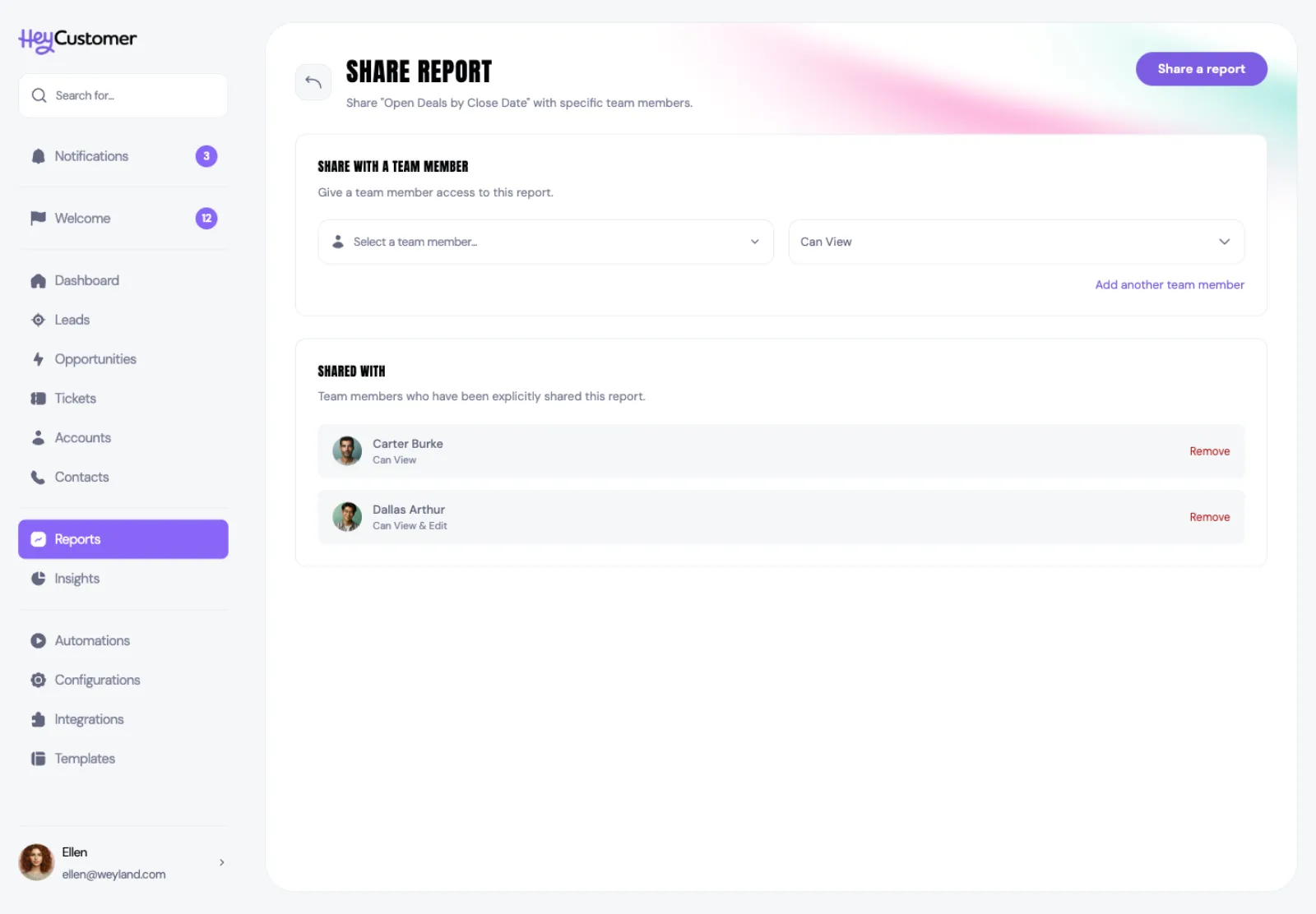
  1. Open the report and go to its share page.
  2. Select a team member.
  3. Choose Can View or Can View & Edit.
  4. Select Add another team member to include more people at once.
  5. Select Share a report. Everyone you add gets an email letting them know.
The Share Report page for a report called Open Opportunities by Close Date, with a team member picker set to Can View, and a Shared With list showing Carter Burke with Can View and Dallas Arthur with Can View and Edit, each with a Remove link.

Everyone you've shared with is listed under Shared with, along with the access you gave them. Select Remove beside a name to take their access away again.

Good to know

  • Your report only ever shows records from your own organization, and only people in your organization can be given access to it.
  • Can View lets someone open and run the report. Can View & Edit also lets them change how it's built. Only you and people with edit access can change or delete it.
  • You can't share a report with yourself, and a person can only be added once — change their access rather than adding them again.
  • The preview while you're building shows up to 50 rows so it stays quick. Saved reports page through the full set of results when you run them.
  • A grouped report shows up to 500 groups. The Bars chart draws the 30 largest and gathers the rest into one Other bar; Share lists every group.
  • A share is a part of a whole, so an average can't be drawn as one — a short note says so, and Bars or Line shows it instead.
  • A saved report is a set of instructions, not a snapshot. Every run reads your data as it stands right then, so results change as your records do.
  • Exports of more than 5,000 rows are prepared in the background and emailed to you instead of downloading straight away.
  • There's a ceiling on how often reports can run — 10 times a minute and 100 times an hour per person — so a report that's already running is worth waiting for rather than re-running.
  • Describing a report in plain English sends your request, your field names, and the values those fields can hold (statuses, options) to Anthropic's Claude to work out the report. Your records and your teammates' names are never sent. Each person can generate up to 20 reports an hour this way.
  • Deleting a report removes it for everyone it was shared with.

Still need help? Email us at support@heycustomer.com

Related articles

No items found.
report, reports, create a report, build a report, report builder, custom report, columns, choose fields, select fields, filter, filters, filtering, sort, sorting, order results, save report, share report, share with team, export report, CSV, Excel, PDF, data source, opportunities report, tickets report, leads report, accounts report, contacts report, documents report, custom fields in reports, relative date, AI report, generate report, describe a report, plain English, natural language report, group, grouping, group by, summarize, summary, totals, average, chart, bar chart, line chart, donut chart, share chart